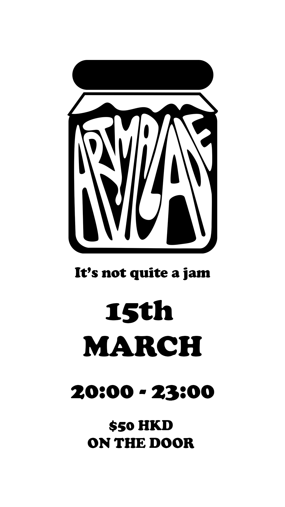
Logo Design
Artmalade
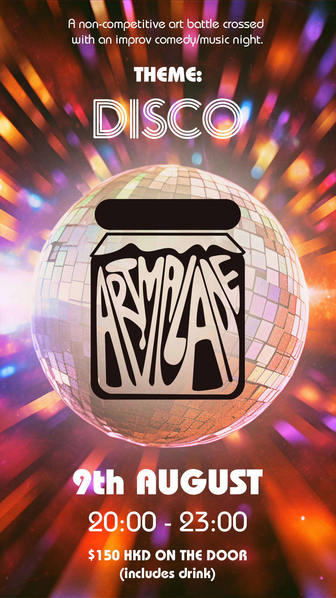
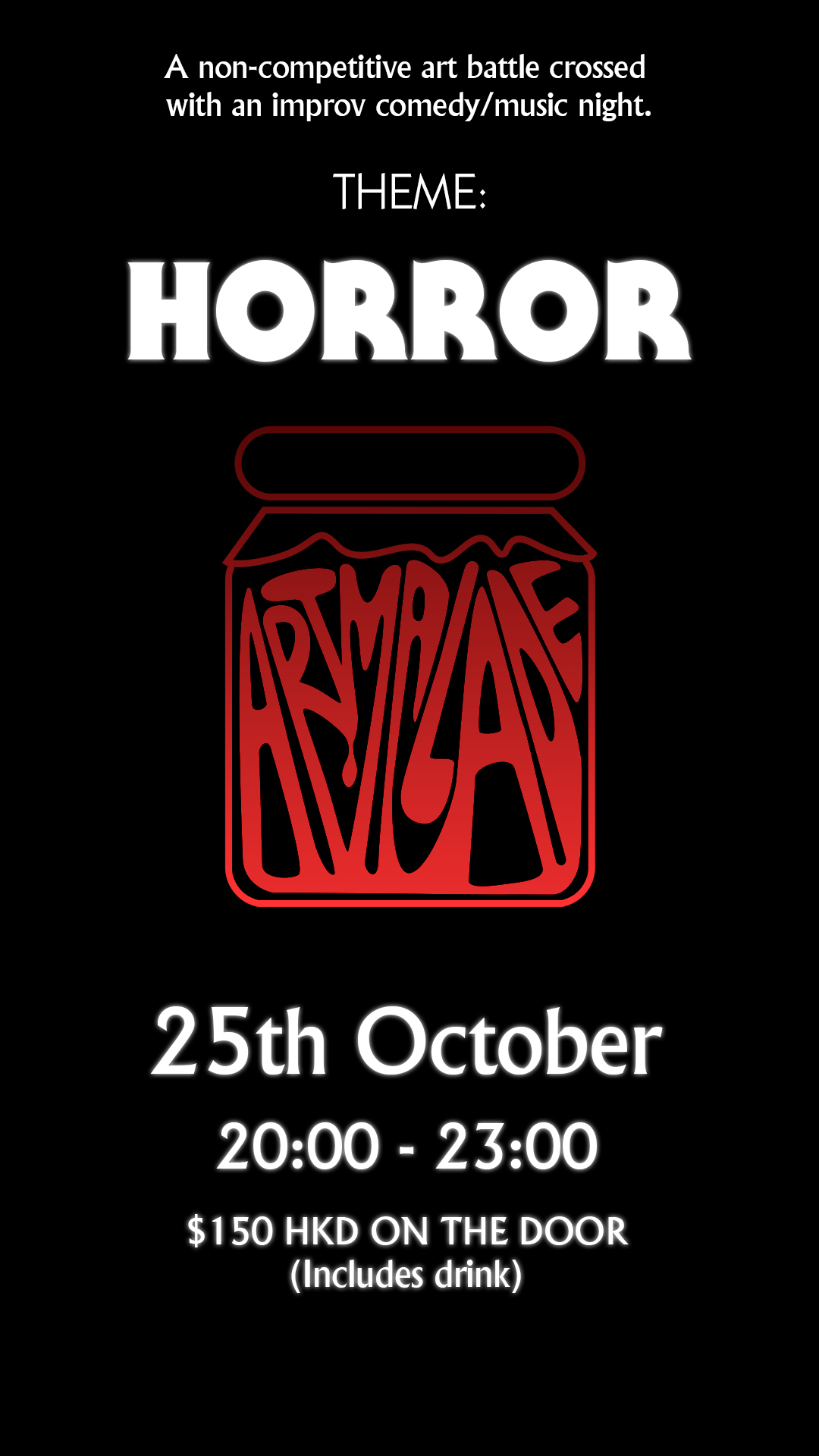
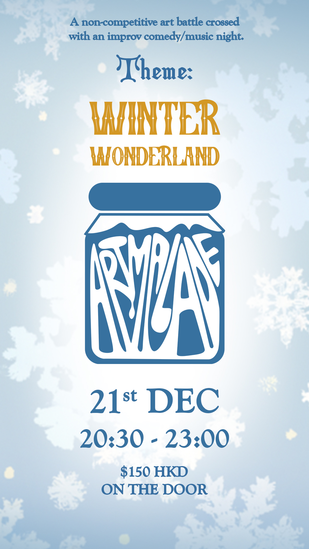
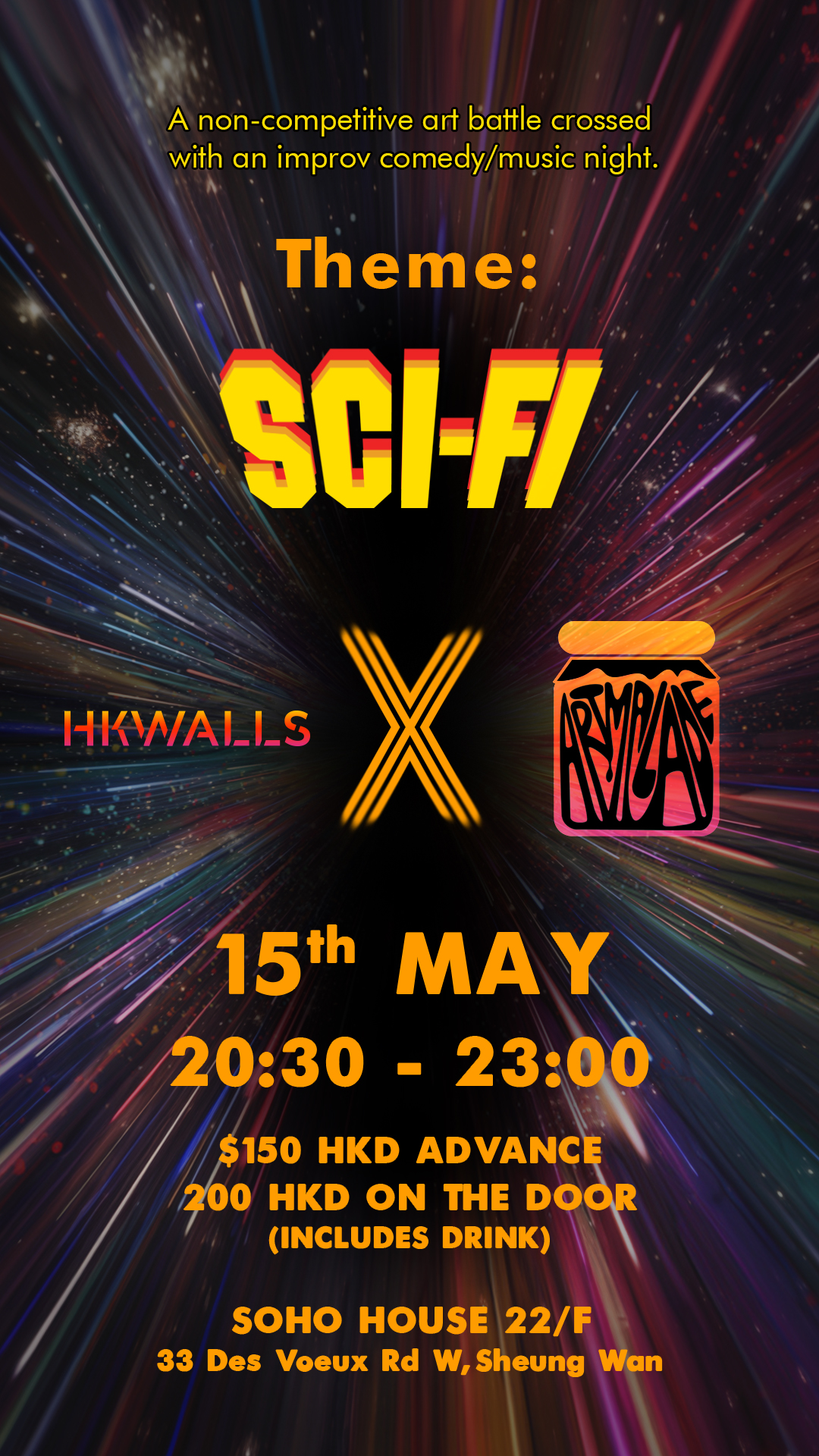
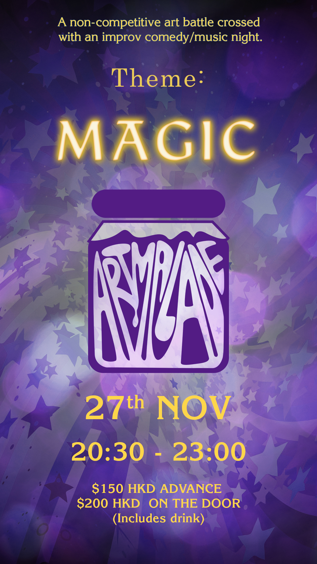
Artmalade is a live event, a non- competitive art battle crossed with an improv comedy/music night.
It is meant to be like a musical jam night, but for art. The only problem is the common perception of what an art jam is, and that doesn’t quite match up.
For the first 6 months there was no distinct brand, furthermore the event itself was constantly changing.
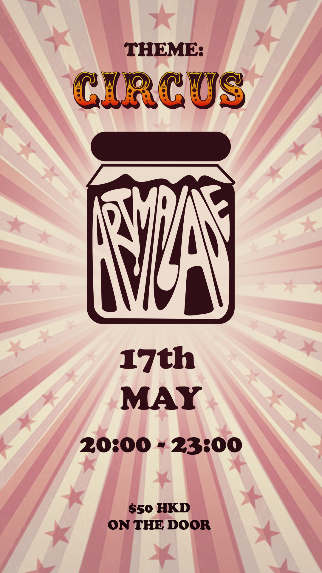
My objective was to create a logo that was recognisable and consistent that would also create equity. The logo also needed to be adaptable due to the changing nature of each event.
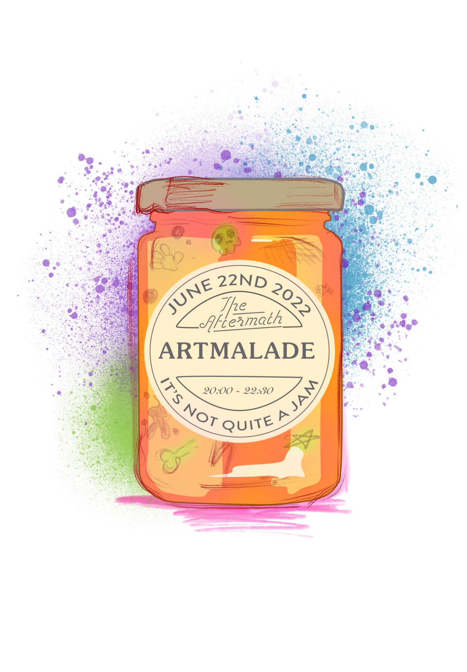
While the event is not quite technically a jam, I wanted to convey its ‘jam’ origins hence the jar as a main element.
I decided to make the text appear almost jam like, but not quite, in order to mirror the spirit of the event and its name.
My intent was that when people see the logo it answers the most common question: What is Artmalade? It’s a jam, but not quite.
Since rebranding, attendance at events increased by 50% over three events. Audience retention has similarly increased, with more regular attendees joining. Additionally, there has been interest from other venues in hosting future events.